
Reimagining EF’s tour product pages to inspire and convert leads
I led the redesign of EF’s Tour product pages to better inspire and convert teachers by balancing aspirational storytelling with the clarity and confidence needed to take action. Through persona-driven design, mobile-first testing, and phased iteration, we reimagined a key conversion touchpoint to support EF’s goal of growing Group Leaders while laying the groundwork for scalable personalization across 250+ tours.
Role UI/UX Designer, Research
Team Maddie Poulin (Copywriter), John Cowan (Marketing Strategy), Adam Schwartz (Creative Director), Brian McQueen (Web Content Manager)
Deliverables High fidelity prototypes, user research
The Challenge
EF’s website was designed primarily for one audience — teachers — but didn’t account for the nuances in journey stage, persona type, or browsing behavior. New visitors exploring EF for the first time often lacked the clarity and confidence to take action.
With EF aiming to grow Group Leaders by 18% year over year, the public site needed to work harder to convert qualified leads, especially through its product pages — a key conversion point that hadn’t been updated in years.
Understanding the Audience
Our primary persona: Adventurous Ari
Ari is a new teacher exploring educational travel for the first time. She’s curious and idealistic, drawn to the impact travel can have on her students — but easily overwhelmed by the logistics.
Emotional goals we wanted Ari to feel:
Excited — inspired by what’s possible
Empowered — informed enough to act
Confident — believes EF can support her
Understood — feels seen as both a teacher and traveler
Our secondary persona: Established Ellen
An Experienced GL who loves the details and wants wants itineraries and logistics upfront.
Established Ellen also provides a design question for: how do we inspire dreamers without losing detail-lovers?
THE PROBLEM
Teachers like Ari need an inspiring, clear, and confidence-building product page that balances dreaming and detail — showing that EF can make travel both exciting and manageable.
How might we inspire teachers while giving them confidence EF will handle the details?
Success metrics
Primary Goal: Increase teacher conversion rate from 0.8% → 1.5%
Secondary Goals:
Improve product page engagement metrics (scroll depth, time on page, CTA clicks)
Tailor content to match user intent and journey stage
Project approach
Phase 1: Design exploration
Create high-fidelity desktop designs to present to senior leadership and illustrate EF’s long-term digital vision. Our focus:
Show breadth of creative strategy and storytelling potential
Position EF as both aspirational and trustworthy
Explore multiple directions for itinerary display, price positioning, and visual hierarchy
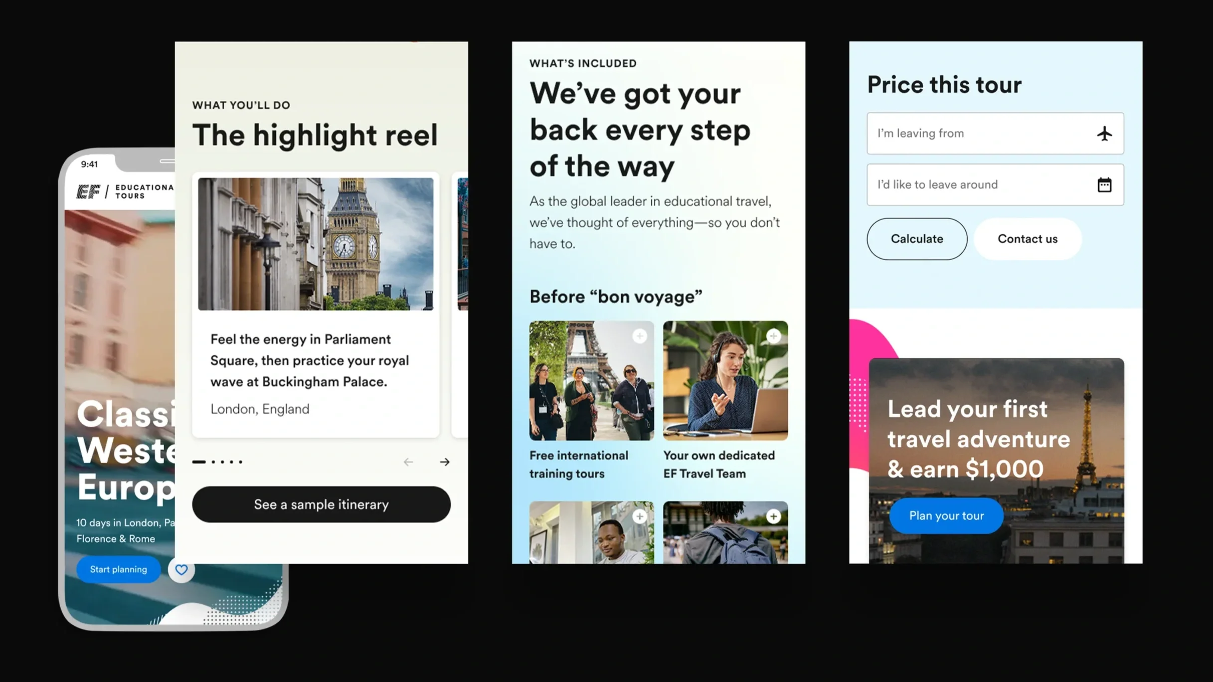
Phase 2: Mobile adaptation & user testing
Following leadership alignment, translate the designs into mobile versions to prepare for usability testing. Goals for phase 2 included:
Prioritize scanability and quick access to call to actions
Improve itinerary discoverability
Maintain emotional tone while optimizing for smaller screens
Adapt designs for user testing
Phase 3: Iteration & launch
After incorporating testing insights, the team prepared for a pilot rollout of the new design on five tour pages before expanding to the entire 250+ tour portfolio. Goals for the rollout:
Validate impact on lead conversion and engagement metrics
Gather behavioral data from real users
Ensure scalability and adaptability across all tours
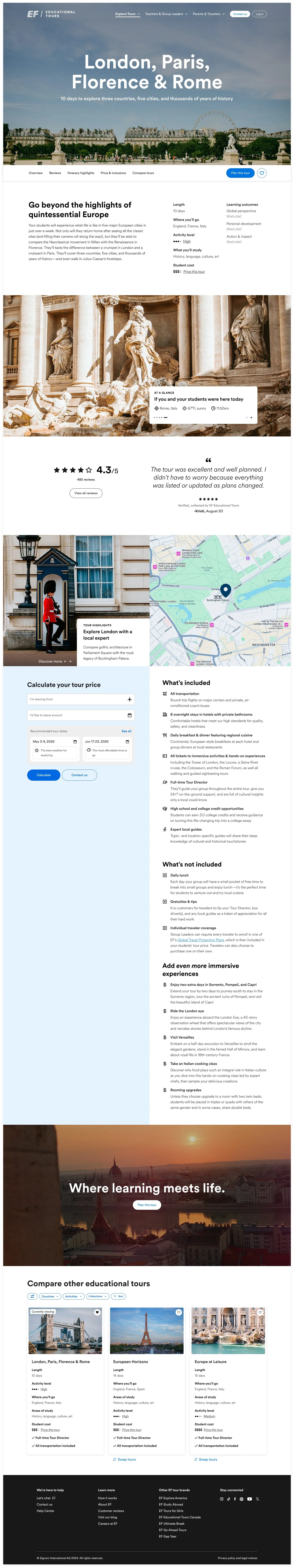
Design exploration
PHASE 1
To validate different approaches and get stakeholder buy in on the design scope, we created two prototype directions, each testing how emotion, clarity, and hierarchy could drive conversion:
1. Mosaic version
Destinations and imagery lead the narrative
Information surfaced through modular tiles
Pros: Visually inspiring, modern
Cons: Heavy on imagery, challenging for mobile
2. Immersive version
Learning outcomes placed earlier in the scroll
Strong balance between dreaming and grounding details
Pros: Higher user comprehension, balanced tone
Cons: Itinerary section still underemphasized
Leadership feedback
Loved: visible destinations, “What’s Included” pairing with price, learning outcomes visibility
Concerns: large images on mobile, too much explanatory text, itinerary buried
Suggestions: elevate CTAs, integrate brand engagement more fluidly, allow “choose-your-own-path” interaction paths
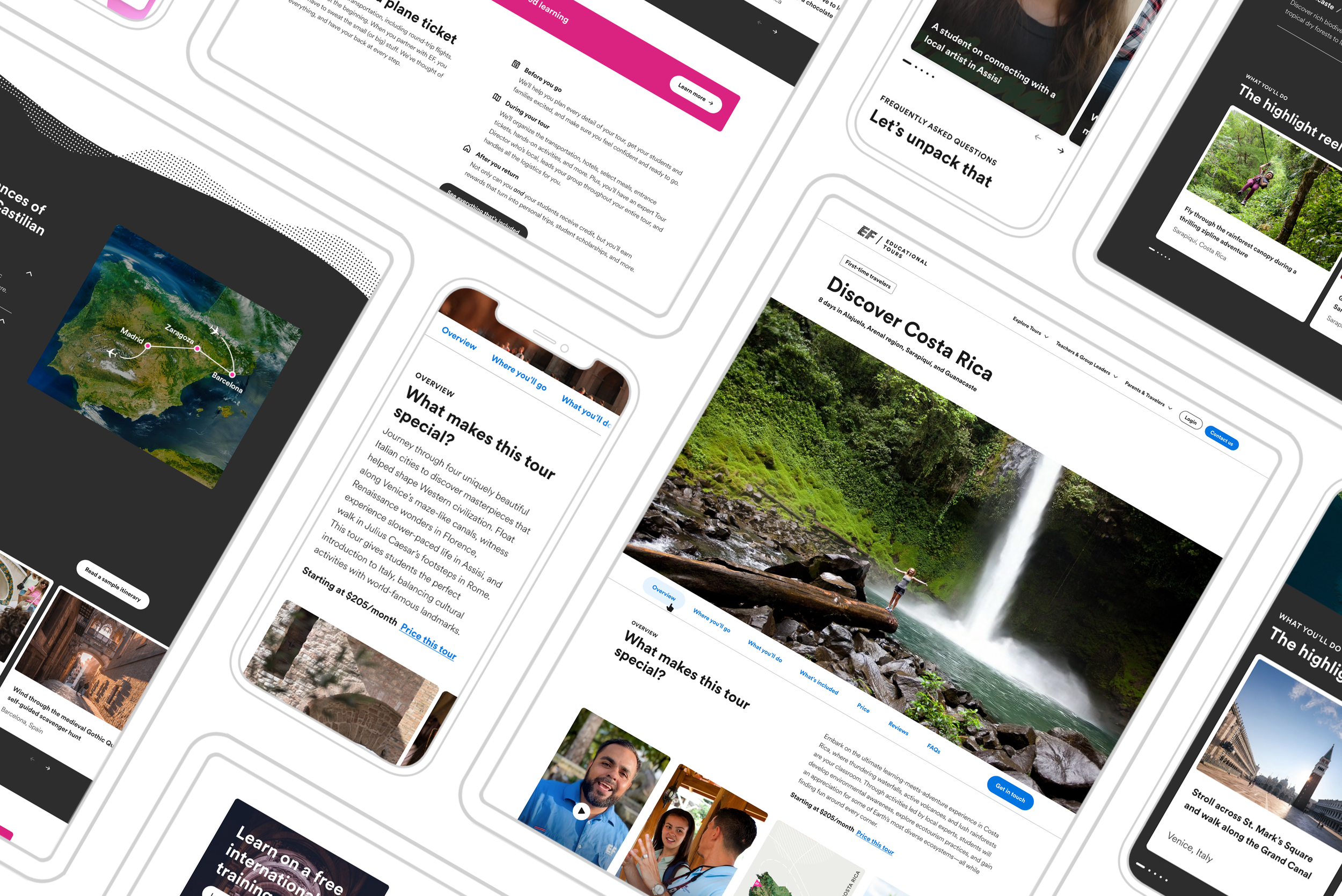
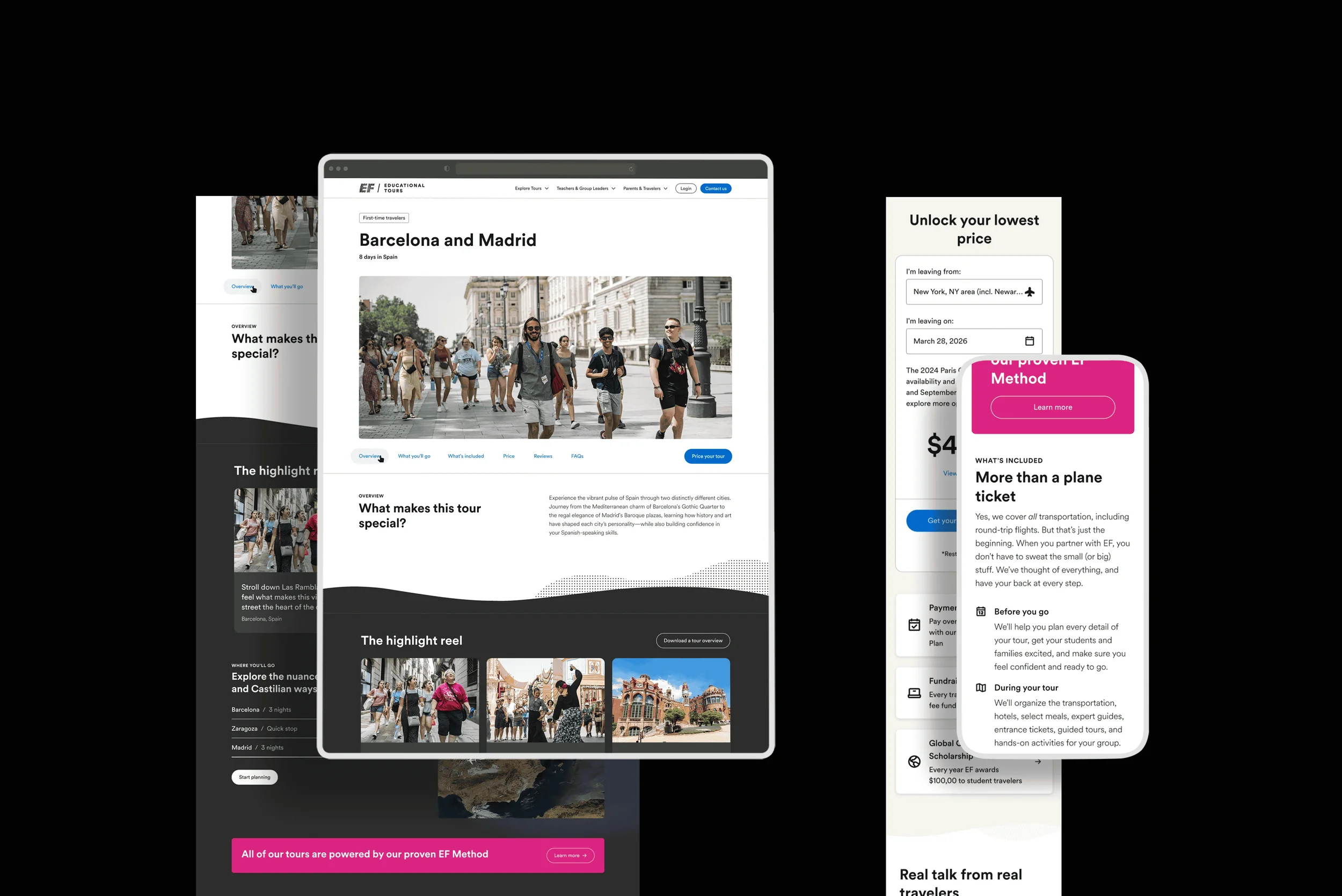
Mobile adaptation & user testing
PHASE 2
Our goal for this research was to evaluate how teachers and educators interact with the redesigned Public Tour Page concepts to understand what content and interactions best build clarity, trust, and intent to convert.
We tested two mobile prototypes with identical content, but distinct visual designs. The focus was on functionality, comprehension, and usefulness, not final visuals (which will evolve with EF’s upcoming brand refresh).
View my full research report here.
Test type: Remote, unmoderated usability testing on Userlytics
Duration: ~30 minutes per session
Participants: 24 teachers, both those familiar and unfamiliar with EF
Total Data: 525 minutes of video/audio recordings
Devices: Mobile prototypes
Top user insights
Itineraries & tour overview
Users expect a detailed, day-by-day itinerary—including travel times, accommodations, meals, and activities.
The interactive map was well-liked but felt disconnected from the itinerary.
✅ Opportunity: Integrate map and itinerary; enable clickable or filterable daily views.
Inclusions & Benefits
Users were confused between “inclusions” and “benefits.”
They want clarity on what’s included, who it’s for (teachers vs. students), and how it connects to pricing.
✅ Opportunity: Create a detailed, structured inclusions section with expandable details and clear pricing context.
Educational value
Teachers want explicit connections to curriculum standards, academic credit, and immersive learning.
✅ Opportunity: Use badges or icons to highlight academic tie-ins and create a dedicated educational value section.
Pricing & planning process
Users want transparent, upfront pricing before committing to contacting us.
Hidden or unclear pricing reduces trust.
✅ Opportunity: Introduce dynamic pricing tools and pair costs directly with inclusions.
_________
Confusion over what happens after clicking “Start Planning.”
✅ Opportunity: Add microcopy to explain next steps (“We’ll reach out within 24 hours”), unify CTA language, and make actions more visible.
PHASE 3
Iteration & launch
After incorporating testing insights, the team prepared for a pilot rollout of the new design on five tour pages before expanding to the entire 250+ tour portfolio.
Goals of the pilot:
Validate impact on lead conversion and engagement metrics
Gather behavioral data from real users
Ensure scalability and adaptability across all tours
Getting more information from real users
After launching the first 5 tour pages in the newly designed template, we ran a series of live tests to see how the pages were performing with real users. These tests included:
Adding a user sentiment survey to the pages to validate people were finding the information clear enough, with the option to give us more details about what they found unclear
Moving user generated content and tour highlights to see if they get more engagement
Testing copy on the itinerary button from Read a sample Itinerary to Download a Tour Overview to see if that reduces engagement with it and focused people more on the itinerary drop-downs
Moving the “What makes this tour special” section down to pair with inclusions
Current impact
Conversion data is showing that these tours are either the top or second best performing tour in their category. The new template hasn’t hurt or broken conversion on these and we will continue to monitor leads converting from these pages as they move through the pipeline.
This redesign was more than a UI refresh—it was a strategic step towards personalization and storytelling on EF’s website. The process of aligning stakeholders, testing with users, and designing for both “dreamers” and “detail-lovers” highlighted the balance between inspiration and clarity.
The new direction sets the stage for EF to evolve from a static tour catalog into a dynamic decision-support platform that grows with its audiences.
What comes next:
Refining designs from the user data we have collected as well as aligning to an ongoing brand refresh
Connecting our Product information management (PIM)
Update the itinerary and map to be more interactive