
Comcast Employer Rebrand
Comcast came to Symphony Talent to help grow awareness of their talent brand and build a pipeline of exceptional candidates across key business segments. They wanted to be seen not just as a cable corporation, but as a tech company as desirable to work for as Apple or Google. At Symphony talent, we help recruit engaged candidates through activating a company’s employer brand with EVP strategy, content marketing, recruiting campaigns and career website design. We designed and launched a new employer brand for Comcast that is helping them standout in a competitive hiring landscape.
Role Art Director
Team Tim Smith, Chris Hansen, Laura Gosnell; Research & Social Strategists

The Starting Point
A snapshot of Comcast’s former employer brand.


Getting a Feel for the Audience
After looking over the research provided by the strategy team, we created mood boards for one of Comcast’s key hiring areas, tech, to represent a high-level stylistic overview of Comcast brand’s potential look and feel.
Through these explorations, we pushed the boundaries of their current brand guidelines, trying different styles and painting with bold visual strokes to develop a look and feel that would resonate with both candidates and current employees. Mood boards focus on bringing out the emotional aspect of the Comcast Employer Brand.
Moodboard Creation

This direction embraced the current Comcast look and feel, yet takes several subtle steps forward. It utilizes a clean design and a thoughtful and restrained introduction of color. Added iconography helps to visualize the brand and add texture without competing for attention.
Direction 1: A Step Forward

Where Direction 1 took a step forward from the current branding, Direction 2 is more of a hop. While still remaining true to brand standards, bold color choices are coupled with considered typography to give off a classy-cool vibe that exudes tech.
Direction 2: A Jump Forward

Direction 3 continues to embrace brand standards while taking a giant leap with unexpected choices. Dynamic and playful, this look utilizes bright, poppy colors to capture moments in a highly impactful way.
Direction 3: A Leap Forward
Testing the Moodboards: What’s the audience reaction?
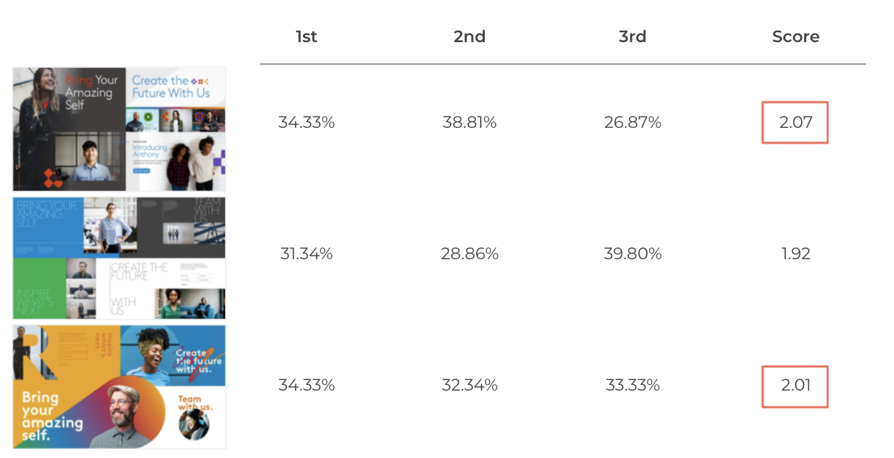
The research team tested the 3 directions below via an online survey with an opt-in targeted audience of 204 participants. They were asked 19 questions (6 questions per visual for 3 visuals, plus a summarizing question) in order for us to better understand how far we could push the new brand.
Participant Demographics
Currently working in a technology role
All U.S. locations
Age 24-64 (with the majority between the ages of 30-44)
All genders
The Results
After receiving all qualitative survey results, they showed a fairly positive reaction to all moodboards, but leaned towards directions 1 & 3.

Welcoming, Modern Environment, Collaborative, Supported, Respected, My perspective will be valued
“Looks like a stable startup, with strong clear messages and missions.”

Collaborative, Supportive, Respected, Modern Environment
“This Visual Is Very Professional, Strategic, And Organized.”
“Not as impactful”

Welcoming, Collaborative, Leading-edge, Entrepreneurial, My perspective will be valued
“Warm, inclusive”
“Looks more modern, forward thinking.”
When asked to rank all 3 visuals, with 1 being the most preferred and 3 being the least, directions 1 & 3 again stood out against direction 2.
Narrowing Down The Design Direction
Option 1 showed a combination of both the stability the audience wants and a few startup-feeling moments in a welcoming environment that supports people as individual teammates. Meanwhile, option 3 created a strong visual draw; a message that Comcast is exciting and unexpected, where you’ll rarely be bored and where your voice matters and is respected.
Creative Development: Concept Boards
Our final step in our Brand evolution focused on taking the most successful elements from the two strongest moodboards, bringing them to life in a Concept Board and doing an internal validation of which direction our team felt brought our talent brand to life the best. Concept boards are meant to represent an optimal state for expressing the Employer Brand.


Final Creative Direction
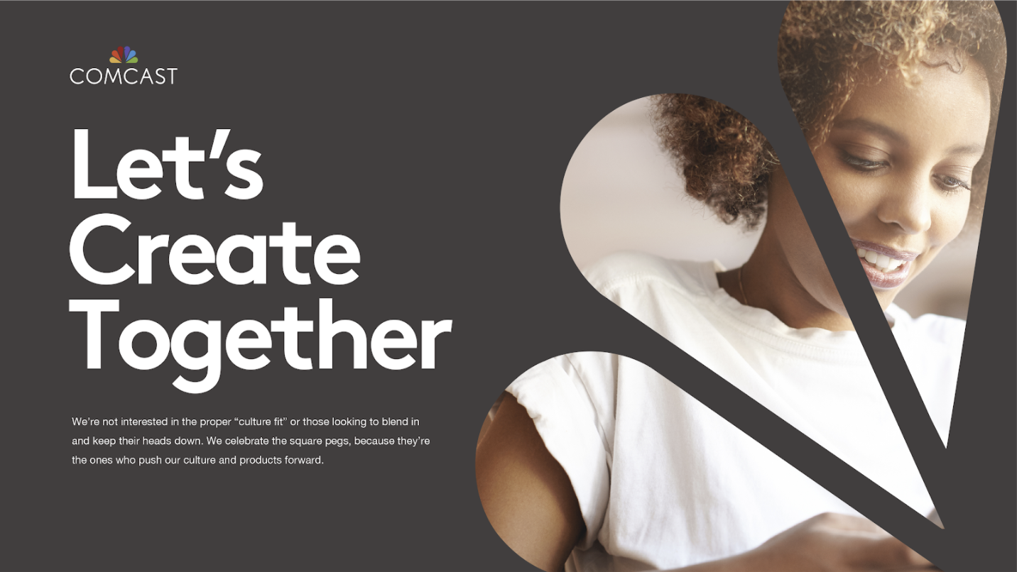
While the Comcast team liked aspects of all the Concept Boards, they felt that the 3rd option was the most unique and stood out against the competition. For this concept, we use monochromatic studio portraits framed by a rounded shape inspired by the well-known peacock feathers in Comcast’s logo to show a glimpse into the personality of employees. It’s a chance to humanize the brand and demonstrate how each employee is an important part of Comcast as a whole.

Bringing It All Together
After finalizing a direction for the creative, I coordinated with the Creative Director, Copywriter, and broader team to implement the designs across platforms. I helped on-board a freelance designer who has been assisting in developing the brand identity as we create more marketing assets.
I also worked closely with the Social Media Manager to coordinate creative with the social strategy and ensured that the brand message continues to stay consistent as we evolve the creative and build out larger campaigns.


Landing Page

Email Marketing Template
