
UX Design & Research for Mobile App
Connector is a mobile app that helps you meet new people in your area through common interests. The idea came about from my personal experience moving to a new city and struggling to meet new people, especially amidst a global pandemic. Through talking with friends about this, many expressed the desire to meet new people and get involved in their community, but they were unsure where to start. Connector helps eliminate the overwhelm that comes with finding events to attend and eases some of the anxiety that comes with talking to new people by providing curated events, friend matches, and conversation prompts.
Role UX/UI Designer, Researcher
Timeline 10-Week Course, ~80 hours of class + project work
Tools Figma, Miro, Maze (usability testing platform)
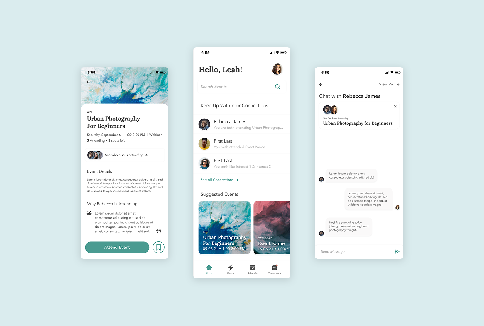
A quick look at the final product

On-Boarding

Event Registration

Messaging
Research: Are others having the same problem?
I conducted user interviews to help me better understand what was holding people back from connecting with others in their city, what would make a someone want use a product that helps them connect with others, and identify any other needs that a user might have when meeting new people.
Participant Demographics
Ages 24-32
Working professionals currently living in a city
Had specific hobbies that they participated in alone
Expressed desire to expand their friend groups
I created an affinity map to organize the qualitative data I collected and uncover underlying themes in the data.

* Colors correlate with a participant
I learned that…
Pre-pandemic, most users met new friends through mutual friends or work.
Users value having a common interest with friends who they can then share experiences with.
Users wanted a more efficient way to connect with friends that wouldn’t drain their energy.
Most users were comfortable starting conversations with people online and found it even easier if they already knew they had a common connection/interest.
Summarizing the Problem
After completing a competitive analysis to better understand what solutions already exist, I summarized the problem to address what is missing from the competitors:
People living in cities need an efficient way to make genuine connections so that they can get more involved in the community while making friends who share a common interest.
Ideate: How might we help people connect with others based on their common interests?
I sketched out some initial ideas on what could go into a product to solve for this problem.


Based on ideas from these sketches and a task analysis of a competitor, I created a feature prioritization 2x2 matrix to help decide on the minimum viable product (MVP).

After narrowing down the features of the product I wanted to focus on, I created a user flow to better understand the path that a user would take to connect and talk with another person.

Design: Sketching & Low-Fidelity Wireframes
Once I had a better idea of an ideal user flow, I sketched out my ideas and created low fidelity wireframes. I decided on creating a mobile app because it’s a platform that the target audience would be comfortable with and be most intuitive for messaging.

Testing & Iterating the Initial designs
Based on the low-fi wireframes, I created a usability test plan and conducted 5 interviews in order to better understand how users would interact with the app and refine my design.
These were the results and changes made based on the testing:

Design System
I created a basic design system to use as a jumping off point for the visual designs of the app. I wanted to keep it friendly, inviting and optimistic to speak to the nature of the product and the target users.

The Initial Designs

The Final(ish) Product
After another round of usability testing, I made some additional tweaks and upped the fidelity of the prototype. The next steps for the project include additional usability testing and branding for the overall app.